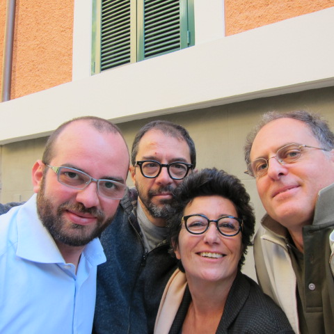
 These are our good friends of many many years! These are the people who keep telling us Gustiamo needs a new website. Fantastic photos of our fantastic products, more enjoyable experience from touch screen devices, integrated communication of Italian style and culture, easier shopping experience on gustiamo.com, better shopping cart.
What else? Any suggestions are welcome!
From left: Luca Pelini, expert in online marketing; Pippo Onorati, the graphic designer and project director; Adriano Cosi, the official photographer.
They, of course, know perfectly and love all our foods and the heros behind them, the artisans. Grazie a tutti!

You should have the products arranged logically by category and not by region.
You can have the background or a sidebar indicate the region, but that shouldn’t be the primary navigation.
Ciao Kevin, thank you so much, that’s what we need, feedback from the outside world! We’ve gotten too used to our site and it’s hard to be objective. When we first designed the website we thought it was important to allow a search by regions, as regionality is a strength of Italian food and of Gustiamo. That was light years ago… Adding your comment to the list, any other change you’d like to see? Keep comments coming, please. grazie!